Metamorphosis
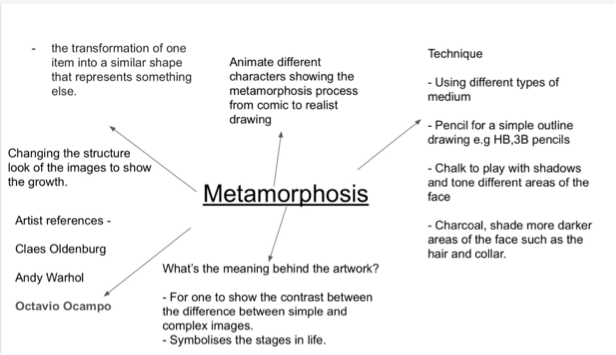
- Metamorphosis - the transformation of one item into a similar shape that represents something else.
Identity Stage
Activity - Mindmap
For this activity we were asked to create a Mind Map based on our chosen theme to look on. My theme was Portraiture Transformation which involves drawing different images based on different styles of Artwork and but changing and altering the facial element (e.g eyes, ears, nose) through Animation
For this activity we were asked to create a Mind Map based on our chosen theme to look on. My theme was Portraiture Transformation which involves drawing different images based on different styles of Artwork and but changing and altering the facial element (e.g eyes, ears, nose) through Animation
Activity - Mood board


Explore Stage
Activity: Artist/Designer/Written Analysis
Artist 1 : Claes Oldenburg
- American sculptor born Jan. 28, 1929 (age 87) in Sweden best known for his public installations that feature the theme every day objects we use.
- Many of his works were made in collaboration with his wife cosmetic van bruggen who died in 2009
- In 1960 he created his first Pop Art environments and happenings in a mock store full of plaster objects.
- In 1965, he did a colossal sized public sculpture such as a pair of scissors ironing boards and a typewriter eraser. - From early 1970s Oldenburg, worked exclusively on public commissions, his first public work "Three- Way Plug" came on Oberlin College with a grant from the National Endowment for the arts.


Keywords: Size, Shape, texture, Appearance, Dexterity, Colour, Personality
|
I like this artist because of his use of comically large objects that we use everyday for different purposes and then changes there size to make them "larger than life". Also for englarging items of food that we take for granted such as a rotten apple core. Also I like how he creates very realistic artworks right down to the detail.
|
Artist Analysis - I have chosen to look at Claes Oldenburg because I am interested in his signature public style artwork of taking everyday objects and making them bigger so you get to see them at a different angle. I admire his use of colour especially in his food objects that are designed to look normal and realistic compared to food. Also I like the blend of colour he uses and more importantly the attention to detail in his artwork especially for example the little nails in the saw.
|
Andy Warhol
- American illustrator/filmmaker, born 1928 - 1987, he was known as the most prolific and popular artists of his time.
- He was known as the "godfather of pop art".
- In his youth, when he was 8 he contracted chorea a rare and sometimes fatal disease that affects the neverous system and was bedridden for months. However, during this period his mother a skilled artist gave him his first drawing artist.
- After graduating college with his bachelor of fine arts degree in 1949 he moved to New York to purse a career as a commercial artist.
- In the late 1950s he began devoting more attention to painting and in 1961 he debuted the concept of "pop-art".


Keywords: Advertisement, Comical, Colour, Style, Culture
Artist Analysis - I wanted to look at Andy Warhol because I admired his style of colour and fine that he brought to advertisement that I believe was purposely designed for the consumer In mind, something that was eye catching and appealing to the eye. I also like the unique style and attitude toward his work that he takes from pop culture.
Keywords: Advertisement, Comical, Colour, Style, Culture
Keywords: Advertisement, Comical, Colour, Style, Culture
Octavio Ocampo
Born in Celaya Mexico in 1943, As the offspring to a artistically - inclined family. A part of his childhood, he predominately studied painting and sculpturing. Producing props and artworks for festivals and church duties. Employed and famous for his surrealist metamorphic style which works by superimposing and combining various figures to create a larger image. Known for his artworks that "unfold" the more that you look at them.
Born in Celaya Mexico in 1943, As the offspring to a artistically - inclined family. A part of his childhood, he predominately studied painting and sculpturing. Producing props and artworks for festivals and church duties. Employed and famous for his surrealist metamorphic style which works by superimposing and combining various figures to create a larger image. Known for his artworks that "unfold" the more that you look at them.


Analysis
|
This video was useful as a reference in terms of what i wanted to do do. I wanted to create an stop motion animation using iStop Motion 3 to play the simplistic images into like a short film. I wanted it to symbolise one specific image that transforms into another image gradually showing exactly how it transforms into something else.
Youtube channel: BozSchurr
|
|
Design/Planning Stage
3.1 Plan/Specificaion
Title/Theme: Metamorphosis
Artist/Designer Role - Illustrator, Photographer, Animator
Media / Processes - Drawing, Editing, Photography
Style / Movement: Pop Art/Metamorphosis
Key Influence(s) - Claes Oldenburg, Andy Warhol, Octavio Ocampo
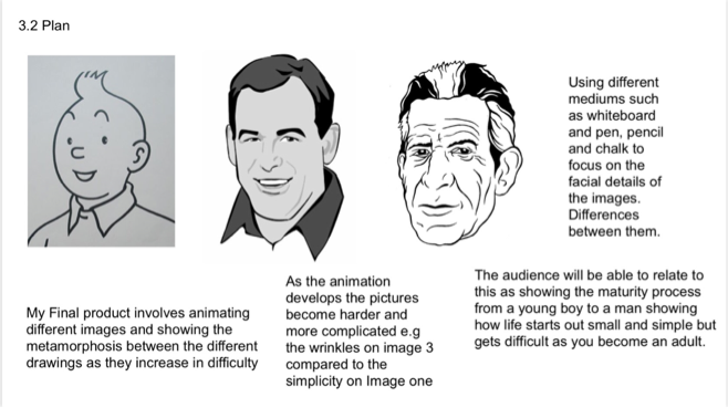
Final Outcome Idea - For my final outcome, I will make a stop motion animation using the theme of metamorphosis to animate different characters showing the metamorphosis process from simple to realistic comic characters using different mediums such as chalk, charcoal and graphite to change the images.
Message / Meaning - My overall message will be contrasting and comparing how on the one hand a cartoon can be so simplistic and on the other can become something difficult to master.
Exhibition Plan - I would prefer to present my work on a projector so that my animation can be projected on to a wall.
Artist/Designer Role - Illustrator, Photographer, Animator
Media / Processes - Drawing, Editing, Photography
Style / Movement: Pop Art/Metamorphosis
Key Influence(s) - Claes Oldenburg, Andy Warhol, Octavio Ocampo
Final Outcome Idea - For my final outcome, I will make a stop motion animation using the theme of metamorphosis to animate different characters showing the metamorphosis process from simple to realistic comic characters using different mediums such as chalk, charcoal and graphite to change the images.
Message / Meaning - My overall message will be contrasting and comparing how on the one hand a cartoon can be so simplistic and on the other can become something difficult to master.
Exhibition Plan - I would prefer to present my work on a projector so that my animation can be projected on to a wall.
Plan
Making Stage
During this stage I began working on my term interim project which involved using an iPod and tripod clicker to take photographs of an image I was drawing on a whiteboard. It was difficult using this medium because it was easy to smudge or go erase out accidentally the lines that I drew so I had to be cautious. I also had two lights at the side focused on the image so that I could get the lighting right.
Then after I had drawn the pictures I started working on editing using software called iStopMotion3 to edit the photos. The tricky park was remembering what image I was on so I didn't use the same one more than once.
Then after I had drawn the pictures I started working on editing using software called iStopMotion3 to edit the photos. The tricky park was remembering what image I was on so I didn't use the same one more than once.


Draft 1
Here is my draft 1 interim project that I based on my plan mainly on. It involved using a whiteboard and pen to draw the characters in the same pose wearing the same clothes to show the metamorphosis transformation from childhood, adulthood to elderhood.
After receiving feedback on my first draft, I needed to work on the transformation of the picture that shows metamorphosis taking place between the characters. Also I needed to work on how an image changes from one thing to another. Instead of copying comic characters that already exist, I decided to make up my own character that changes form.
Thumbnail Sketches
These are my thumbnail sketches. For my first one I drew a normal tree that becomes a person with dark slanted eyes ands to have their hair in the shape of a bird's nest to have birds flying away in the distance. The second drawing is more of a sequence allocation which starts out as a fish but morphs into a human eye by expanding the retina. My chosen drawing is of a women's long hair that becomes the body of a bird that has different patterns and designs on it but then changes removing the face.


Making the Animation


Using iStopMotion 3 again, I started working on my end product for the exhbition. I wanted my drawing to become one thing but then morph into another so that it plays with the auidence's perspective of what they see. The next step was after I finished the animation, I would then export my work on to iMovie to then have it critiqued and then edited.
Editing

After editing and working on iStop Motion 3, I exported my work on to iMovie for the final cut. This was were I put up the animated shots together like it was a animated short. Adding in an intro and background music to create an inspirational and creative atmosphere for the audience. The part I found difficult was trying to make sure that the whole animation ran smoothly without footage that overlapped or didn't show at all.
Draft 2
The symbolism behind the artwork is that it starts out as an girl in a deep slumber and her hair is layed out like a lion's maine on the floor. Then the pictures shifts from being hair to being a bunch of leaves stattered about and a small bird nestled within the leaves. It changes again to show rebirth, as an beautiful flower that has many different patterns and details put into it with the petals around it. I used for reference flowers such as a sunflower to help me vision the ending. I wanted the animation to show life aftet death being reborn as something else that is just as innocent yet magnifcent to look at.
Activity: Self Reflection
Spark - I think that I showed Spark by coming basing it on a image I've found online but then going away from that and building it into my own interpetation which is what challenged me the most.
Craftsmanship - However I do think that the first draft, I focused more on atttention to detail, I really attempted to focus on the structure and design of the image and how it transforms.
Expertise - Going back to animation after i previously did it during year 7 & 8, At first I found it very difficult to go and work on becuase at times I suffered problems such as the camera not in focus and trying to get the exact right angle to adjust the lens so it would not suddenly change position during the animation.
Development - However the ways I could improve are by ultizing different mediums such as charcoal and chalk to work on black card. Another would be to look more in depth on what I was transforming one thing into.
